This exercise was designed to make us think about narrative and the photographs needed to illustrate a story. Thought needed to be given to equipment, location and also how to lead a viewer through the story.
I decided to document a calligrapher at work. The office was extremely small and thought had to go into how to negotiate the difficulties of the size and layout of the office. The shoot was only possible with my Sony a55 and a variety of lenses. The flip screen of the a55 and the wide angle lens were the most important pieces of equipment. When I do documentary work I like my subjects to be genuinely working and therefore I don’t use photographic lighting as it can cause distractions and even be dangerous in confined settings.
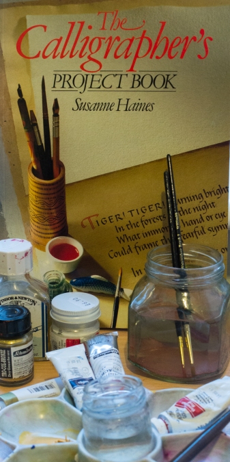
Image 1. For use as a front page or a filler illustration of equipment needed for the calligraphy task. I juxtaposed the equipment on the table with the cover of the reference book to make it look as if equipment on the desk had walked out from the instructional book cover. A 35mm prime lens was used for this.
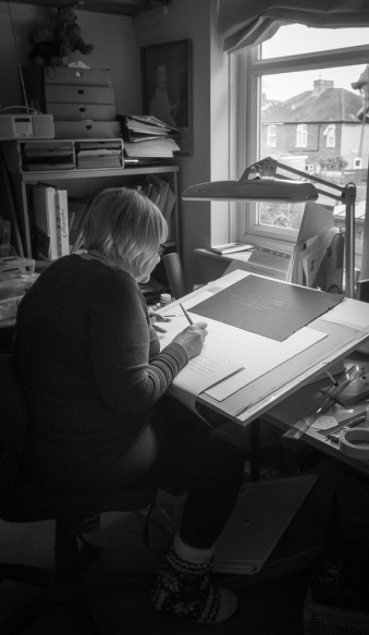
Image 2. This introduces the environment and the subject to give some context. I had no other option but to use an 11 – 16 lens. Some distortion is evident but it doesn’t distract at all unless you are looking for the distortion. I was careful to make sure that the essential elements of the image suffered as little distortion as possible. The ‘dead space’ above is suitable for text or an overlapping image. PLEASE CLICK ON CONTINUE READING JUST BELOW.
Image 2.
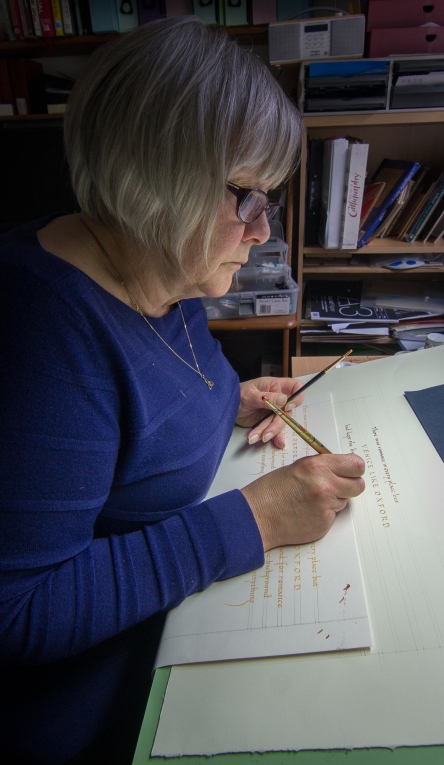
Image 3. This introduces the subject and her work more intimately. We can see the ruled lines and concentration involved. Again, with thanks to the position of a brick wall I had to use a wide angle lens and the flip screen.
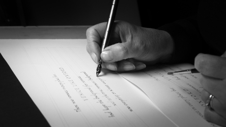
Image 4. This introduces the tools in use. Loading the nib with gouache.
Image 5. Application of gouache to paper.
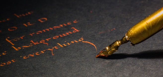
image 6. The calligrapher is experimenting on two different coloured papers. This macro image clearly shows detail of the nib, gouache and text.
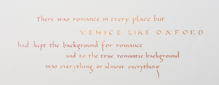
Image 7. The final piece of work. The subject didn’t want to ‘pose’ so this is how I completed the set. However I recognise that an image that shows connection with the subject is the ideal.
Conclusion.
In reality, when providing images to a magazine/ publisher, we have no choice or say in how our images are placed together. Every time some of my documentary/ photojournalistic work is published I am slightly upset by the formatting of my work.
These images are varied in style and technique and there are images here for half pages, double spreads or inserts. Text can be placed over a couple of the images too. Most articles I have experience of don’t run more then a few images at a time the images chosen demonstrate exactly what’s needed and nothing more.
The only issue with this set that I have is the lack of eye contact with the camera in any of the images and therefore a feeling of connection to images is lost.
Experimenting here with juxtaposition I can see how I could use this skill effectively to bring creative narrative to life.
